最近工作需要在邮件内容中展示一些图表,例如折线图、柱状图、圆饼图等。采用的方案为:
- 用Matplotlib生成图表并保存成文件
- 将图片添加为邮件的附件
- 最后通过
src="cid:0"的方式将图片嵌入到邮件正文中
这篇文章主要对 Matplotlib 的使用做些总结,包括 Matplotlib 如何配置显示中文字体,折线图/柱状图/圆饼图相关介绍,matplot子图的概念。
配置中文字体支持
-
确定系统已有哪些支持中文字体
linux下运行
fc-list :lang=zh命令会输出所有支持中文的字体。 如果为空,可以按如下步骤添加:- 拷贝一份window
C:\windows\fonts\目录下的任一中文字体文件,例如MSYH.ttc(微软雅黑) - 重命名为MSYH.ttf,并放到linux的
/usr/share/fonts/chinese/目录下 - linux下执行
fc-cache /usr/share/fonts/chinese清空字体缓存
- 拷贝一份window
- 修改matplotlibrc配置
- 打开python安装目录下的
lib/site-packages/matplotlib/mpl-data/matplotlibrc文件,将font.family和font.sans-serif这两行开头的注释删掉,并在font.sans-serif这行添加Microsoft YaHei(或系统支持的其他中文字体) - 删除
~/.cache/matplotlib缓存目录
- 打开python安装目录下的
-
修改python代码,指定使用中文字体
1
2
      from matplotlib import rcParams
      rcParams['font.sans-serif'] = ['Microsoft YaHei']
曲线图/柱状图/圆饼图介绍
柱状图
-
Demo
-
API 封装
下面是我对柱状图的一个封装,方便使用者直接调用:
1
2
3
4
5
6
7
8
9
10
11
12
13
14
15
16
17
18
19
20
21
22
23
24
25
26
27
28
29
30
31
32
33
34
35
36
37
38
39
40
41
42
43
44
  def save_bar_fig(data, legends, x_labels, y_label, title, filename):
      """
          data: 柱状图输入数据,对应demo为:[(20, 35, 30, 35, 27), (25, 32, 34, 20, 25)]
          legends: 图例,显示在柱状图的右上角,标记柱状图的数据信息,对应demo为:['Men', 'Women']
          x_labels: x坐标的标签,对应demo为:['G1', 'G2', 'G3', 'G4', 'G5']
          y_label: y坐标标签,对应demo为:'Scores'
          title: 图表名称,对应demo为:'Scores by group and gender'
          filename: 保存的图片文件名
      """
      width = 1.0  # 柱状图每个bar的展示宽度,为了方便这里hard code
      num_of_labels = len(x_labels)
      num_of_legends = len(legends)
      ind = np.arange(0, num_of_labels * width * (num_of_legends + 1), width * (num_of_legends + 1))  # the x locations for the groups

      # 彩虹配色,以此实现每个bar显示不同的颜色
      colors = plt.cm.rainbow(np.linspace(0.9, 0, num_of_labels))

      # figsize:图片的大小,越大图片展示越清晰
      fig, ax = plt.subplots(figsize=(12, 8))
      rects = []
      pos = 0

      for r, color in zip(data, colors):
          rect = ax.bar(ind + pos, r, width, color=color)
          pos += width
          rects.append(rect)

      # add some text for labels, title and axes ticks
      ax.set_ylabel(y_label)
      ax.set_title(title)

      # set_xticks:设置x坐标标签的位置
      ax.set_xticks(ind + (num_of_legends * width)/2)
      ax.set_xticklabels(x_labels)

      # 设置legend
      ax.legend(rects, legends)

      plt.savefig(filename)

      # 注意每画完一个图,要清空plt的状态
      plt.clf()
      plt.cla()
      plt.close()
折线图
-
Demo
没找到合适的官方 Demo。
-
API 封装
折线图的 api 和上面的柱状图差不多:
1
2
3
4
5
6
7
8
9
10
11
12
13
14
15
16
17
18
19
20
21
22
23
24
25
26
27
  def save_line_fig(data, legends, x_labels, y_label, title, filename):
      """
          data: 折线图输入数据,例如:[(20, 35, 30, 35, 27), (25, 32, 34, 20, 25)]
          legends: 图例,显示在折线图的右上角,标记折线图的数据信息,对应demo为:['Men', 'Women']
          x_labels: x坐标的标签,例如:['G1', 'G2', 'G3', 'G4', 'G5']
          y_label: y坐标标签,例如:'Scores'
          title: 图表名称,例如:'Scores by group and gender'
          filename: 保存的图片文件名
      """
      plt.figure(figsize=(12, 8))
      data_len = len(data[0]) + 1
      xAxis = range(1, data_len)  # Make x, y arrays for each graph
      colors = plt.cm.rainbow(np.linspace(0.9, 0, len(legends)))
      lines = []

      for l, color in zip(data, colors):
          line, = pl.plot(xAxis, l, c=color)
          lines.append(line)

      pl.legend(lines, legends)
      pl.title(title)
      pl.ylabel(y_label)
      pl.xticks(xAxis, x_labels)
      plt.savefig(filename)
      plt.clf()
      plt.cla()
      plt.close()
饼状图
-
Demo
-
API 封装
1
2
3
4
5
6
7
8
9
10
11
12
13
14
15
16
17
18
19
20
21
22
23
24
25
26
  def save_pie_fig(data, labels, title, filename):
      """
          data: 饼状图输入数据,对应demo为:[15, 30, 45, 10]
          labels: 饼状图的图例,对于demo为:['Frogs', 'Hogs', 'Dogs', 'Logs']
          x_labels: x坐标的标签,例如:['G1', 'G2', 'G3', 'G4', 'G5']
          y_label: y坐标标签,例如:'Scores'
          title: 图表名称,例如:'Scores by group and gender'
          filename: 保存的图片文件名
      """
      # make a square figure and axes
      pl.figure(1, figsize=(12, 12))
      num_of_labels = len(labels)
      # 是否需要突出,例如 demo 中的 Hogs
      explode = [0 for _ in labels]
      colors = plt.cm.rainbow(np.linspace(0.9, 0, num_of_labels))

      pl.pie(data, explode=explode, labels=labels, colors=colors,
                      autopct='%1.1f%%', shadow=True, startangle=90)

      # x轴和y轴相等,绘制出来的饼状图是圆形
      plt.axis('equal')
      pl.title(title)
      plt.savefig(filename)
      plt.clf()
      plt.cla()
      plt.close()
子图
matplot 支持绘制子图,相当于把一张图分隔成几个区块,每个区块是一个绘图区域。该特性通过 subplot 函数来实现。
-
Demo
subplot 函数的签名为 subplot(m, n, k)。参数 m 表示划分的行数,n表示划分的列数,k表示使用第k个子图(从左到右、从上到下的顺序)。
demo 中第一次调用
plt.subplot(2, 1, 1),表示划分成两行(m = 2),使用第1个子图来绘制(k = 1)。之后再次调用plt.subplot(2, 1, 2),表示划分成两行(m = 2),使用第2个子图来绘制(k = 2)。因此最终效果是上下两个子图。 -
其他效果
-
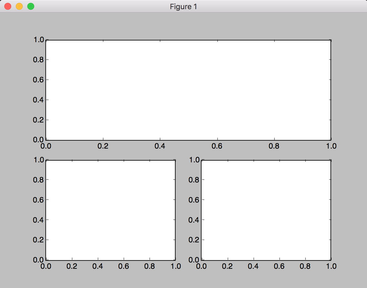
上一下二:
-
代码
1
2
3
  plt.subplot(2, 1, 1)  # 按照两行一列划分,使用第一个子图,即为第一行
  plt.subplot(2, 2, 3)  # 按照两行两列划分,使用第三个子图,即为四个网格的第三个(左下)
  plt.subplot(2, 2, 4)  # 按照两行两列划分,使用第四个子图,即为四个网格的第四个(右下)
-
图例
-
-
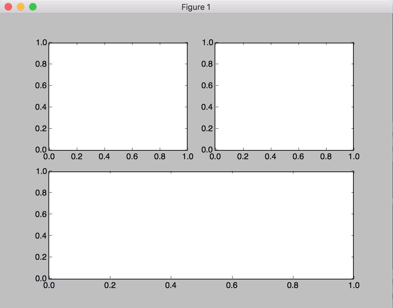
上二下一:
-
代码
1
2
3
  plt.subplot(2, 2, 1)  # 按照两行两列划分,使用第一个子图,即为四个网格的第一个(左上)
  plt.subplot(2, 2, 2)  # 按照两行两列划分,使用第三个子图,即为四个网格的第二个(右上)
  plt.subplot(2, 1, 2)  # 按照两行一列划分,使用第二个子图,即为第二行
-
图例
-
-